

I’m not having a go, I’m just saying.
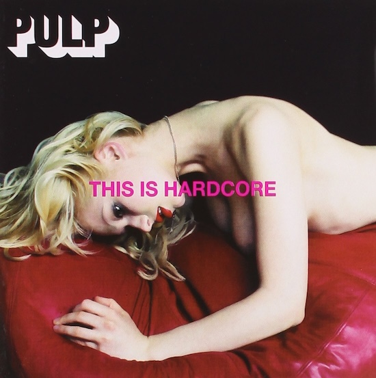
The first thing that hits you round the face is the artwork. When I first encountered it, I wasn’t sure if it felt quite right looking at it, let alone touching it, feeling it, handling it, thinking about it. Believe it or not, I even had a hard time thinking that it really existed. But there it was, Pulp, lovely Pulp, my Pulp, your Pulp, our Pulp, had decided to illustrate their latest record with a cover featuring a picture of a naked woman crouched and draped – flung? – across a puce leather sofa, her elongated neck arcing unsettlingly towards her open mouth and detached eyes, the album’s hot pink title stamped obscenely across her skin. On closer inspection, one couldn’t actually tell whether the woman was alive or dead. Or was she indeed not real, and actually a blow-up doll? And was she even, perhaps recovering from, or in the midst of, a degrading sexual act?
Before I had a decent chance to consider my innermost feelings on the subject, I got a call from a radio station, asking whether I could come into their news studios to defend the use of such a provocative image as part of such a prominent band’s album artwork. Posters for the album on the London Underground system had just been defaced with graffiti stating ‘This Off ends Women’, ‘This Is Sexist’, and ‘This Is Demeaning’, and I wasn’t entirely sure I disagreed with any of the protestors who’d voiced their concerns in such a timely fashion. The Independent on Sunday took a typically meta stance on the subject, suggesting that “whoever designed the controversial poster must be feeling pretty pleased with themselves: it has gained the pop group plenty of extra publicity”. Not everything’s about publicity, you know, I must have thought at the time, somewhat disingenuously, although, rather worryingly, the paper went on to suggest that “the woman looks as if she had been raped”. Either way, it turned out Mrs. Muggins here had to get up at 6 a.m. one morning to face a cross-examination from some of the angriest people in the country.
You could say I was out of my depth, or you could say I hadn’t prepared properly. Either way, my innocent musings on the subject of porn as art as marketing as promotion, were repeated in the news bulletin on the hour, every hour, for as long as it took for my friends to start ringing me, to ask if that really was me on the radio sounding so harangued and upset. And was I actually, alright? At one point, I think I may have read out a statement which said, “Anyone who listened to the album and thought that Pulp are in any way sexist is a fool,” which I am sure kicked the discussion into the long grass for several minutes, but when the album artwork’s designer, Peter Saville, claimed that “our first proposals for posters on the Tube and on the backs of buses were rejected, which is a triumph really,” I winced at the prospect. “For the whole thing just to have passed without a murmur would have been a great disappointment,” continued Saville. “To have to redo things is slightly rewarding.”
It was art director and graphic designer Saville – best known for his album sleeve designs for Factory Records, a label he co-founded alongside Tony Wilson and Alan Erasmus in 1978 – that Jarvis and Steve had originally commandeered – via an initial phone call, and then a visit to Peter’s swanky, two-thousand-square-foot Mayfair apartment – to “present Pulp more as a rock band,” according to Saville, since “the music was a lot deeper, darker and moodier.” Saville himself understood the title to be more about the 1997 spirit of Pulp, rather than pornography. “It was the new, hard, resolute spirit in Pulp,” he told author and New Statesman design critic Hugh Aldersey-Williams in May 1998. “The band wanted to be taken seriously. Jarvis talked to us about fame and how it changes the world around you – yet you are still supposed to be the same person.” In 2023, Saville wrote an essay entitled, ‘The Apartment’ for Paul Burgess and Louise Colbourne’s 2023 photobook Hardcore: The Cinematic World of Pulp – a lush visual celebration of This Is Hardcore, featuring unseen photography, behind-the scenes interviews and revealing visuals – in which he revealed that:
When working on the campaign material for the album, when it came to ads on the side of double decker buses, Transport for London were prepared to accept the album image alone on a bus, and they were prepared to accept solely the title This Is Hardcore – but they were not prepared to accept the image and the title together!
As a source of visual inspiration, the young American painter John Currin proved to be the key to the project. Currin’s work, as described by Aldersey-Williams, “typically portrays seedy, ageing playboys and improbably fulsome women in a hyper-realistic style.” Much later, whilst writing in The Guardian in 2003 – under the banner headline, ‘They’re not grotesque – they’re beautiful’ – Jarvis said that he was “struck by Currin’s images of powerful men,” continuing:
They are surrounded by women who seem to be sucking up to them, but really, they’re thinking: ‘What a jerk!’ They’re always old blokes with beards, and young women; that resonated at the time. I especially recognised his Martini Man advert paintings – the works he did using adverts from Penthouse and other magazines. He would take these photos of men in swimming pools, surrounding bikini-clad women looking up admiringly, but then paint over them so that the women were grimacing.
Pulp would go on to use Currin’s painting, The Neverending Story, as part of the artwork for the ‘Help the Aged’ single, and he seemed a natural fit for a record sleeve that was likely to cause as much fuss as the rest of Currin’s work to date. Having said that, the cover turned out to be quite unusual for Currin, since he’s a painter and the images he ended up producing are photographs.
Jarvis goes on to explain how Saville got Currin to come up with scenarios for the sleeve:
The pictures were shot in London’s Hilton Hotel – by fashion photographer Horst Diekgerdes – which is supposed to be a luxury place, but in fact it’s a bit tacky. His pictures showed people in luxurious settings not really fitting in properly – which at the time really fitted in with what the band was talking about. Without being too literal about it, he communicated the general discomfort that was being felt by Pulp.
For his part, Saville’s essay reveals that “John … and I soon established a fluency between ourselves, identifying references, specifically material of an ‘adult nature’, which we’d share in order to define the type of image we wanted to achieve.”
“There is a shared aesthetic between John’s paintings and the characters in Jarvis’s songs,” Currin’s art dealer, Sadie Coles, would explain to Dylan Jones in a Sunday Times article at the time. “Essentially, they are both dealing with human frailty, and faded glamour. Cocker seems genuinely excited by the possibilities and the power of visual art, but although he’s undoubtedly a great chronicler of our times, and there is often a genuine poetic quality to his writing, he’s got quite a sad demeanour.”
Once the photographs had been chosen – some of them feature band members gazing somewhat forlornly at semi-naked women in semi-provocative, though perhaps ambivalent, poses, whilst the centre spread is an uber-glossy pic of a heavily made-up Jarvis sitting at the hotel bar alongside actor slash model John Huntley – Saville’s longterm accomplice, Howard Wakefield, digitally manipulated them. Paul Hetherington was also heavily involved in the design process, using a particular effect on all the photographs – an Adobe Photoshop filter called Smart Blur. “It gave the photographs a very painterly quality,” says Wakefield, although Saville is quick to point out, “we don’t quite know what it – Smart Blur – does. But fascinating things happen between A and B that are not aesthetics-based.” Correspondingly, Aldersey-Williams would suggest, “at full strength, it alters an image so that it looks as if it was painted by numbers. But used gently, it nudges it from photographic reality into painterly photorealism.”
Of course, all this kerfuffle fails to address the fact that when Diekgerdes shot Pulp at the Hilton Hotel in Park Lane – as part of a tableau of larger-than-life characters, and in order to create “a weird world” – the band subsequently saw the photographs, and decided that they wanted something more hardcore for the cover itself. An image of Steve Mackey and a male actor standing facing each other was subsequently rejected by both Jarvis and Steve as being too weak. By now, everyone had run out of money, but a final dash to Saville’s apartment – which he’d turned into a swanky celebration of a 1970s ‘shag pad’ with the help of Hacienda designer Ben Kelly – for a photo shoot proved successful, resulting in the actual front cover shot.
Addressing the not-quite-real appearance of the model, Aldersey-Williams explains in his piece for the New Statesman, “Rather than paint Cocker and his confreres, Currin art-directed scenarios in which the members of the band appeared alongside anonymous models, models chosen for their super-real characteristics – the too amazing body, the too-perfect skin. They look perfect, yet there’s something that tells you they are not.” Strangely enough, this was exactly what the band were looking for – an image that accurately represented the themes in the music – but does it work? And should it have been allowed to work?
Of course, in a nutshell, my main issue with the This Is Hardcore artwork is that it’s not really a painting, is it? Instead, for all intents and purposes, several men have ensured that the camera has interceded between you and the subject, and we’ve just gone straight back to pornography, and talking about pornography, all over again. Which, presumably, is what Pulp wanted in the first place. Jarvis Cocker would go on to explain that “one of the themes of the album was the deadening and dehumanising nature of pornography,” but does that really excuse the image from any offence it might cause? To which the reply might be: so what image are Pulp supposed to use to illustrate their music? Which, I would counter with: I’m sorry, but a snuff movie pretending not to be a snuff movie is still a snuff movie.
But consider, if you will, the furore that surrounded Vladimir Nabokov’s novel Lolita upon its release. Now, I am not naïve enough to suggest that this ‘fuss’ remotely resembled that surrounding the release of This Is Hardcore, but there are some similarities nonetheless – not least the fact that younger generations now draw attention to acts of sexual harassment and victimisation in a way that older generations wouldn’t have bothered passing comment on.
Originally published by Paris Olympia Press in 1955, Lolita was rescued from obscurity – and the porn shops of Paris – by the author Graham Greene, after he named it as one of the three best books of the year in the 1955 Christmas issue of the Sunday Times. As a collector of rare books, I have always been fascinated by the book’s publishing history – an original Paris edition of the book, signed and dedicated to Greene from Nabokov himself, was briefly owned by Bernie Taupin, and ended up selling for $264,000 at Christie’s auction house in 2002 – but it is the book’s reviewing history that I find most intriguing. Back when Greene was lauding the book, the Sunday Express called it “sheer unrestrained pornography” and its editor, John Gordon, “the filthiest book I have ever read”. Upon its first publication in the US several years later, in August 1958 to be exact, The New York Times called it “repulsive, highbrow pornography,” which, when you think about it, is not a million miles away from the point our Underground protesters were trying to make in the first place. As part of an excellent piece in Vice magazine, headlined ‘This Bullshit World Was Predicted by Pulp’s This Is Hardcore’, Andrea Domanick suggested it was “hard to say whether the subway vandals missed Pulp’s point, or helped make it,” but you could still imagine a world where Pulp, Peter Saville, Horst Diekgerdes, Howard Wakefield, Paul Hetherington, and John Currin all joined up with the vandals for a sit-in against the artwork, protesting both for and against its beautiful-not-grotesque profanities.
By 1998, the year This Is Hardcore hit record stores, the Board of the Modern Library had already set about voting Lolita. No. 4 on its list of the twentieth century’s greatest English-language novels, where it has remained ever since. In the decades following its publication, the book has reached almost canonical standing amongst scholars – by 2015, The New Yorker was arguing that “Lolita secured for Nabokov over time a reputation as a master of English prose second only to Joyce” – but it is constantly being re-evaluated as a piece of work that perpetuates a toxic sexualization of young girls.
And herein lies the rub: for just as the model for the This Is Hardcore shoot couldn’t speak for herself – although, the eighteen-year-old Belarusian “up-and-coming glamour model” Ksenia Zlobina did tell FHM magazine that “the shoot was fun. Jarvis is very nice, very shy” – so Lolita is silenced by the novel’s narrator, Humbert Humbert. As a result, we end up objectifying both Ksenia and Lolita, since we know so little about them. Nabokov famously declared that he “didn’t give a damn for public morals,| but he also described Humbert Humbert as “a vain and cruel wretch who manages to appear ‘touching’,” so I think he knew what he was doing. As do we.
On that note, I have to take issue with the way the woman is positioned. And the fact that when Peter Saville decided to use “a censorship-type approach to the typography, as if it had been stamped by the Board of Censors,” the title is carefully positioned between the eyebrow, chin and arm, and it just makes me think it’s stamped on her face like she’s owned. And that’s with the proviso that I have some sympathy with Jarvis when he told Melody Maker in June 1998 that “the idea behind the picture was that, initially, it would be attractive, you’d look at the picture and realise it’s a semi-clad woman. But then her look is vacant. It almost looks as if she could be dead, or a dummy. So, it was supposed to be something that would draw you in and then kind of repel you a bit. That was on purpose.” As much as I agree with Jarvis that the works of John Currin are beautiful, and not grotesque, I guess I can’t help feeling conflicted by that cover.
Perhaps, in the spirit of fairness and compromise, I should leave the last word to Aldersey-Williams. “Once Saville had massaged the pictures with his computer,” he notes, “the result is a layer cake of reality and artifice: real model, looks unreal; camera never lies, but the computer embellishes the truth. This is why, even on close examination – especially on close examination – it is impossible to decide about the woman on the album cover.”
So, there you have it
And anyway, I’m not having a go. I’m just saying.
Jane Savidge’s book on Pulp’s This is Hardcore is published in Bloomsbury’s 33 1/3 series. The 33 1/3’s are short books about popular music, focusing on individual albums by artists ranging from MF Doom to Madonna and from Black Sabbath to Britney Spears.